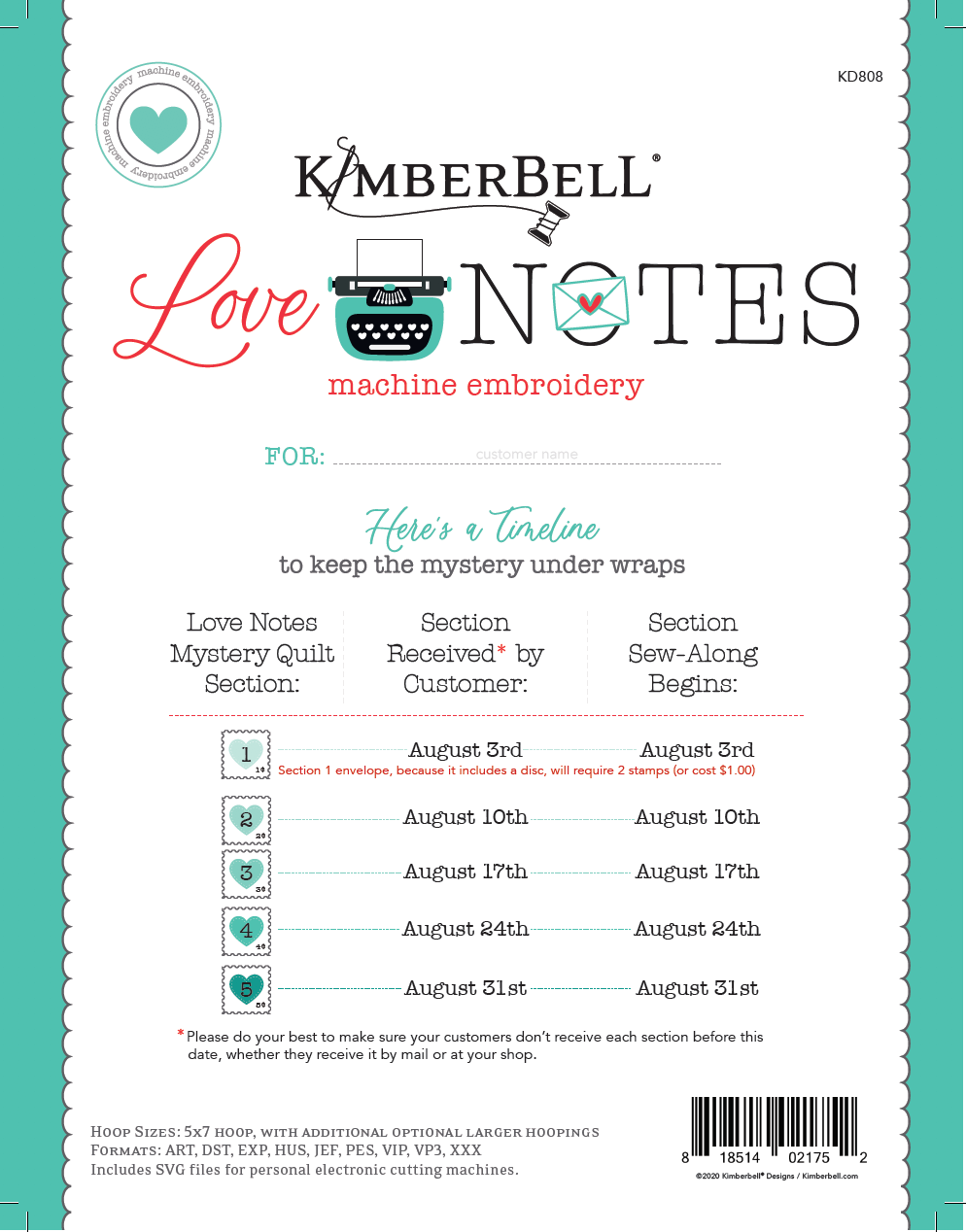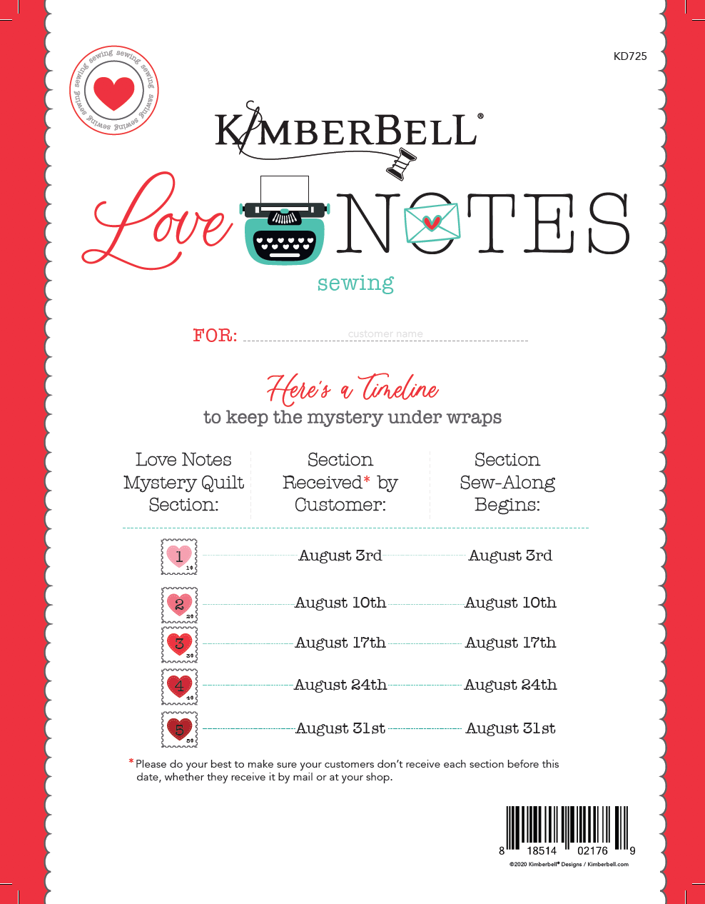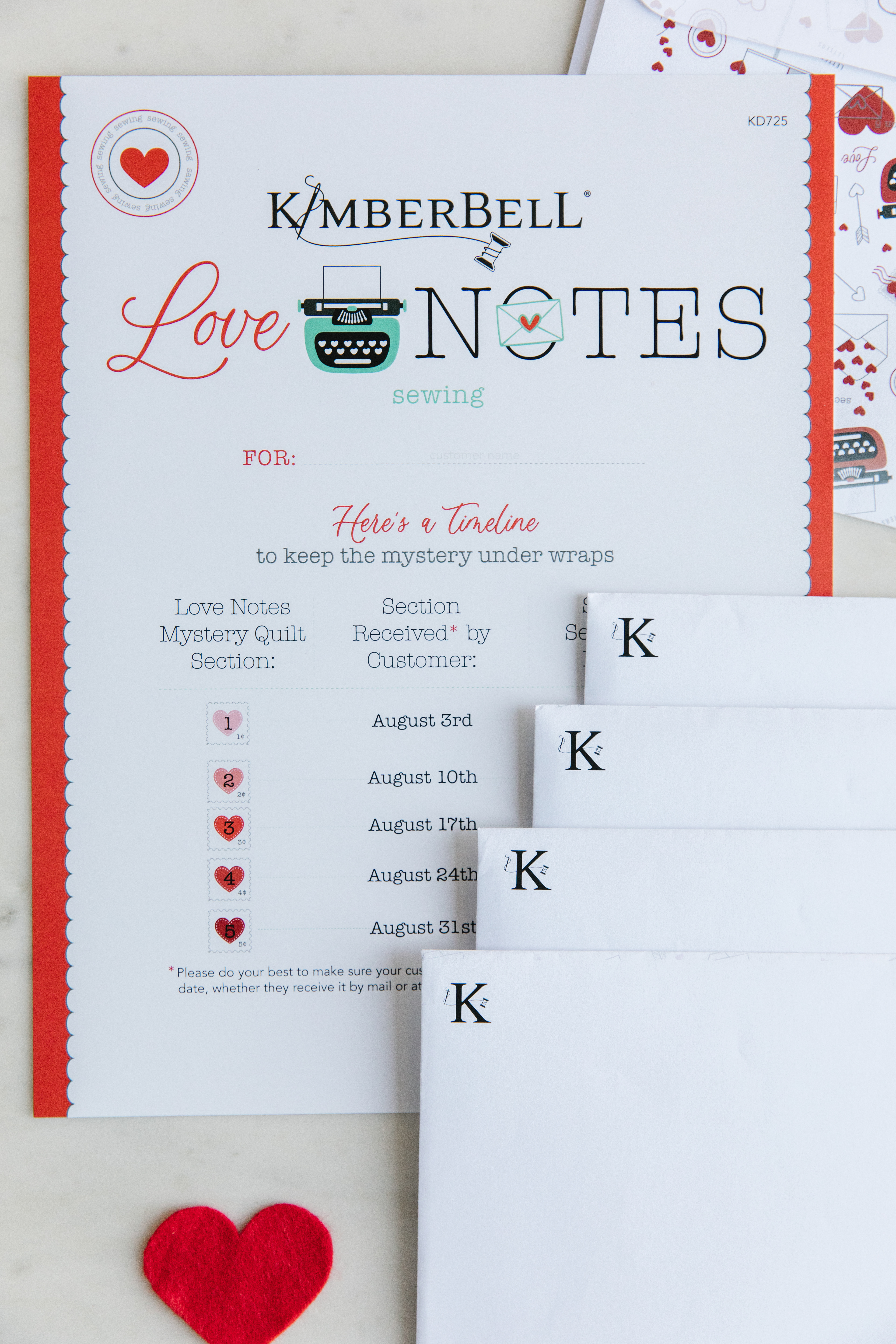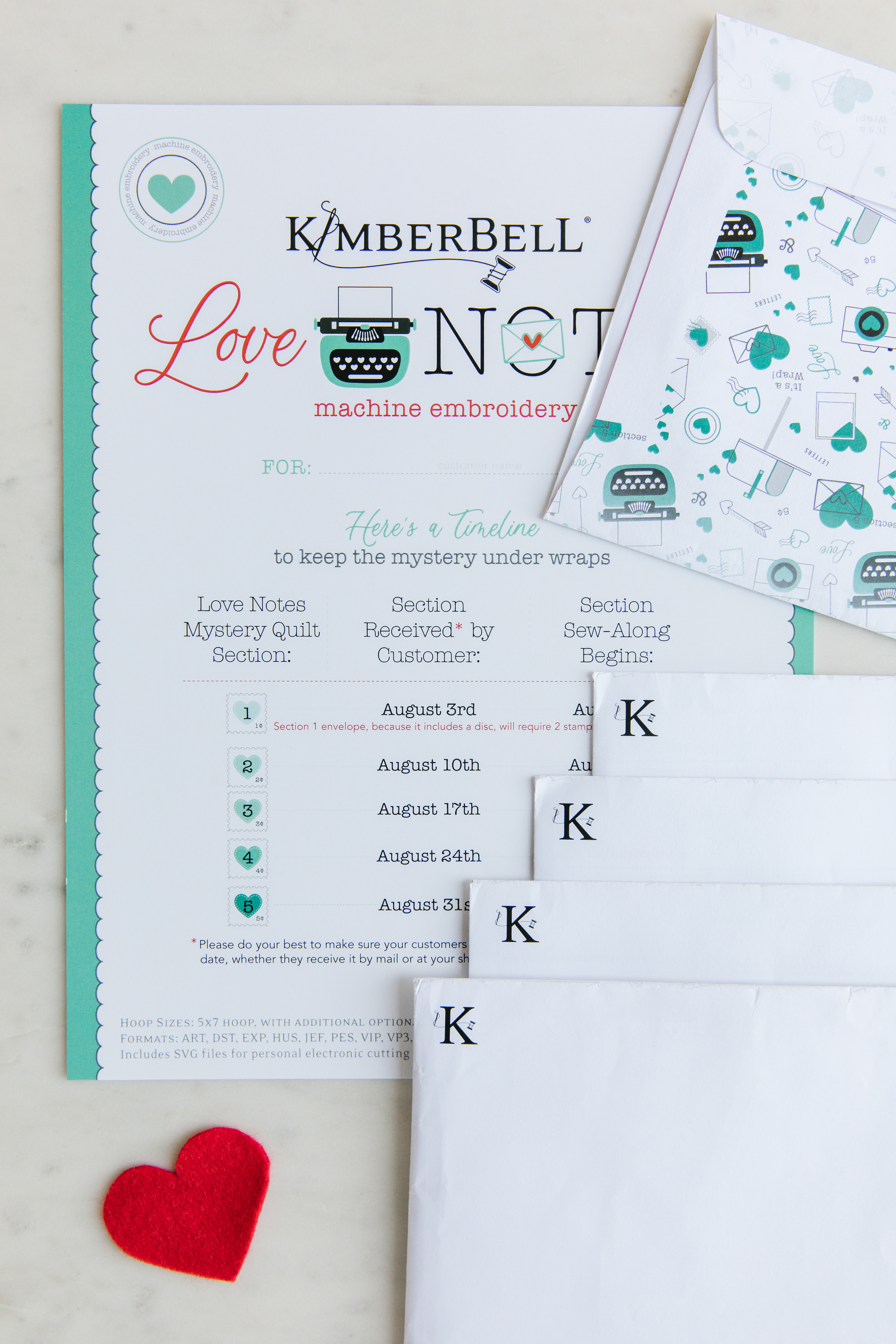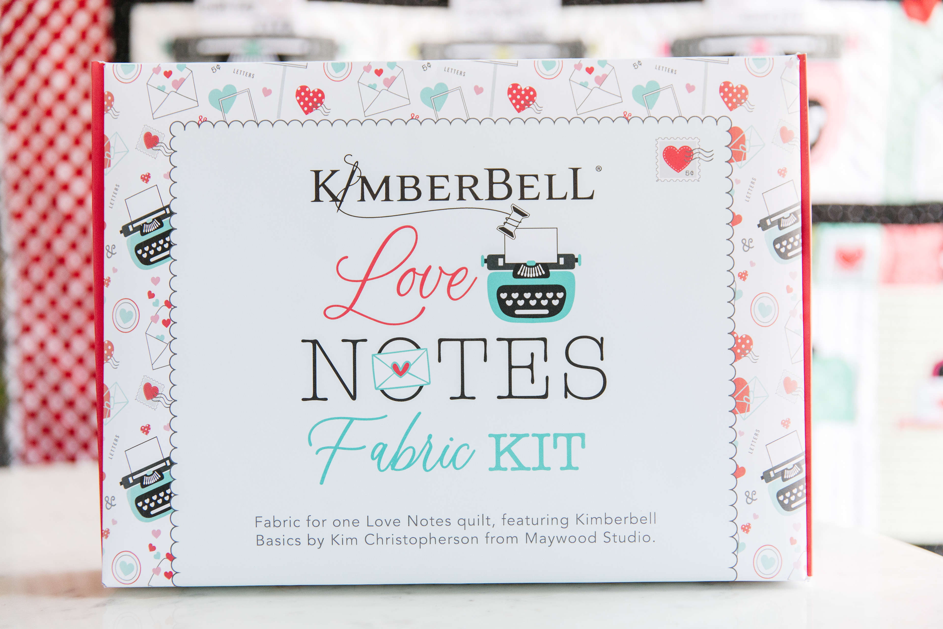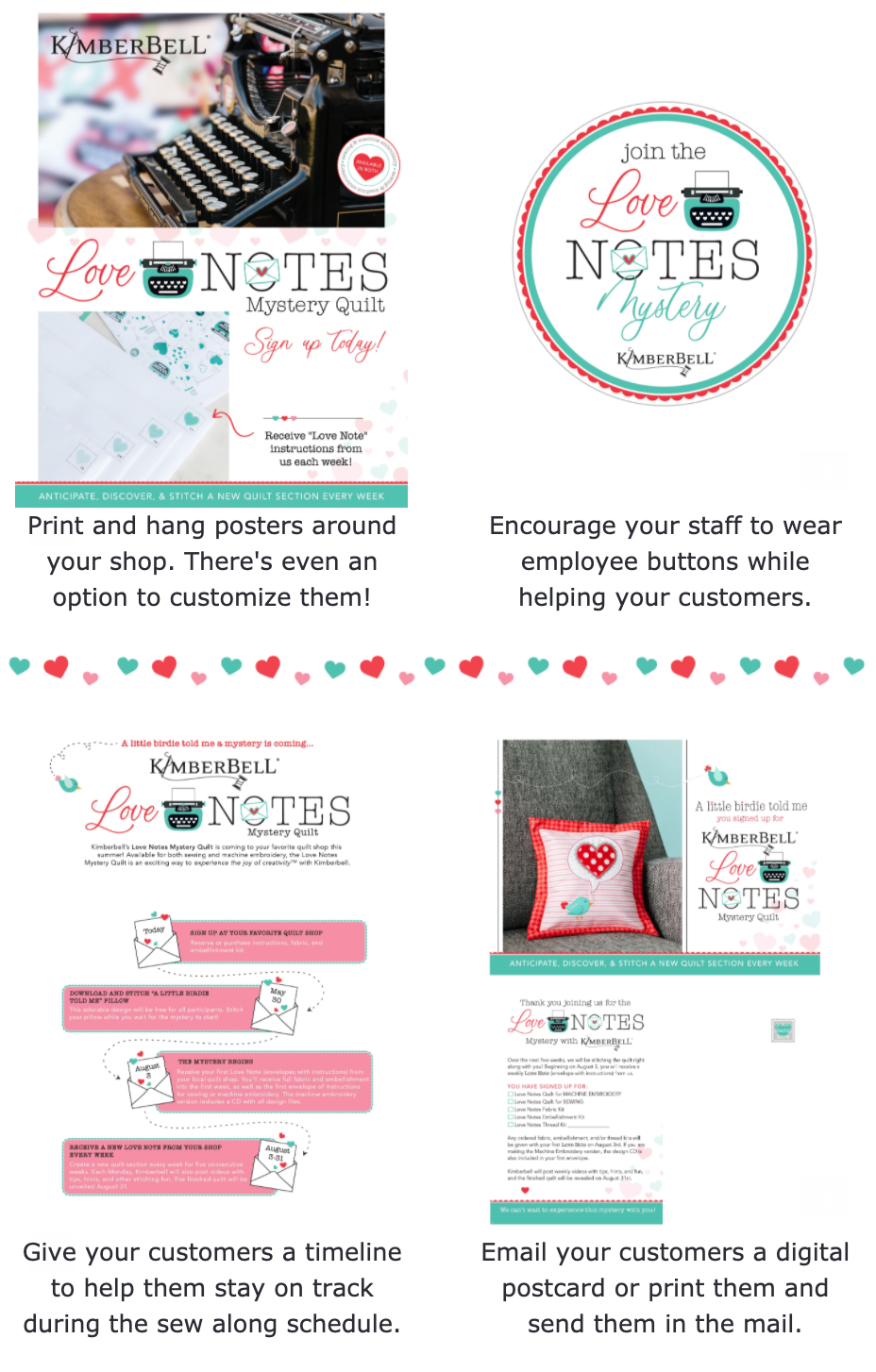
Introducing Kimberbell’s Love Notes Mystery Quilt, coming Summer 2020!
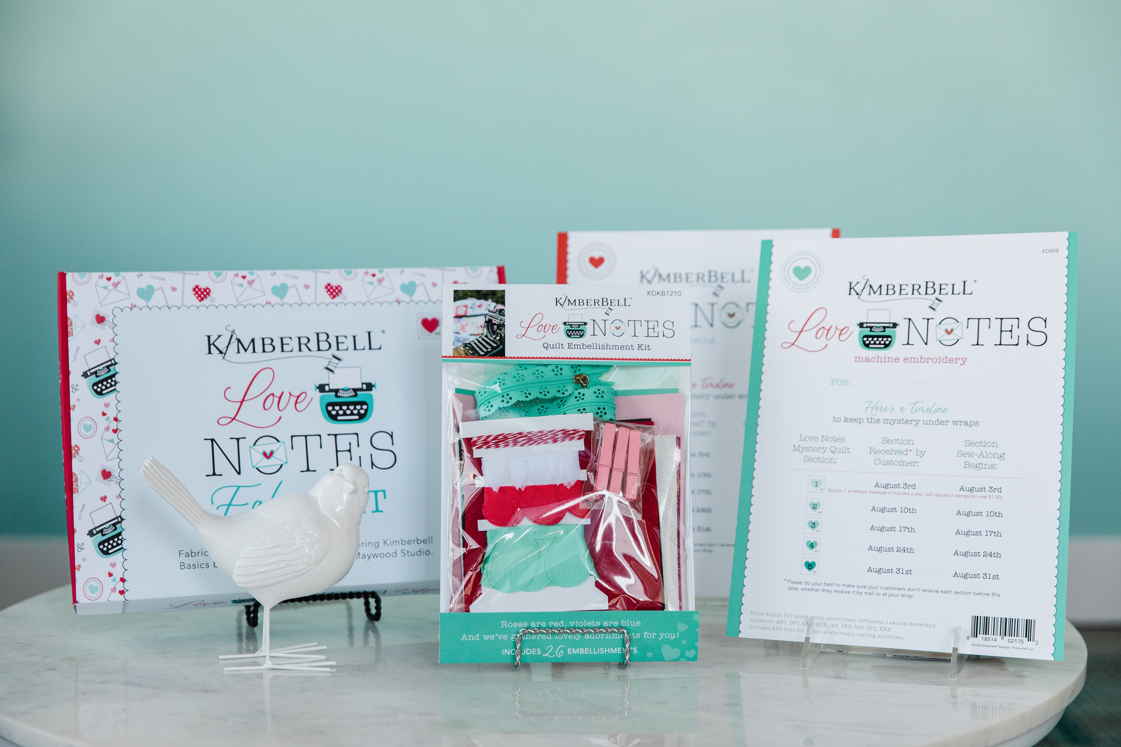
A fun and effective way to engage with customers every week, participants will stitch a new section of the quilt over five consecutive weeks (without knowing how the entire project comes together until the very end)! Take a look and join the mystery!
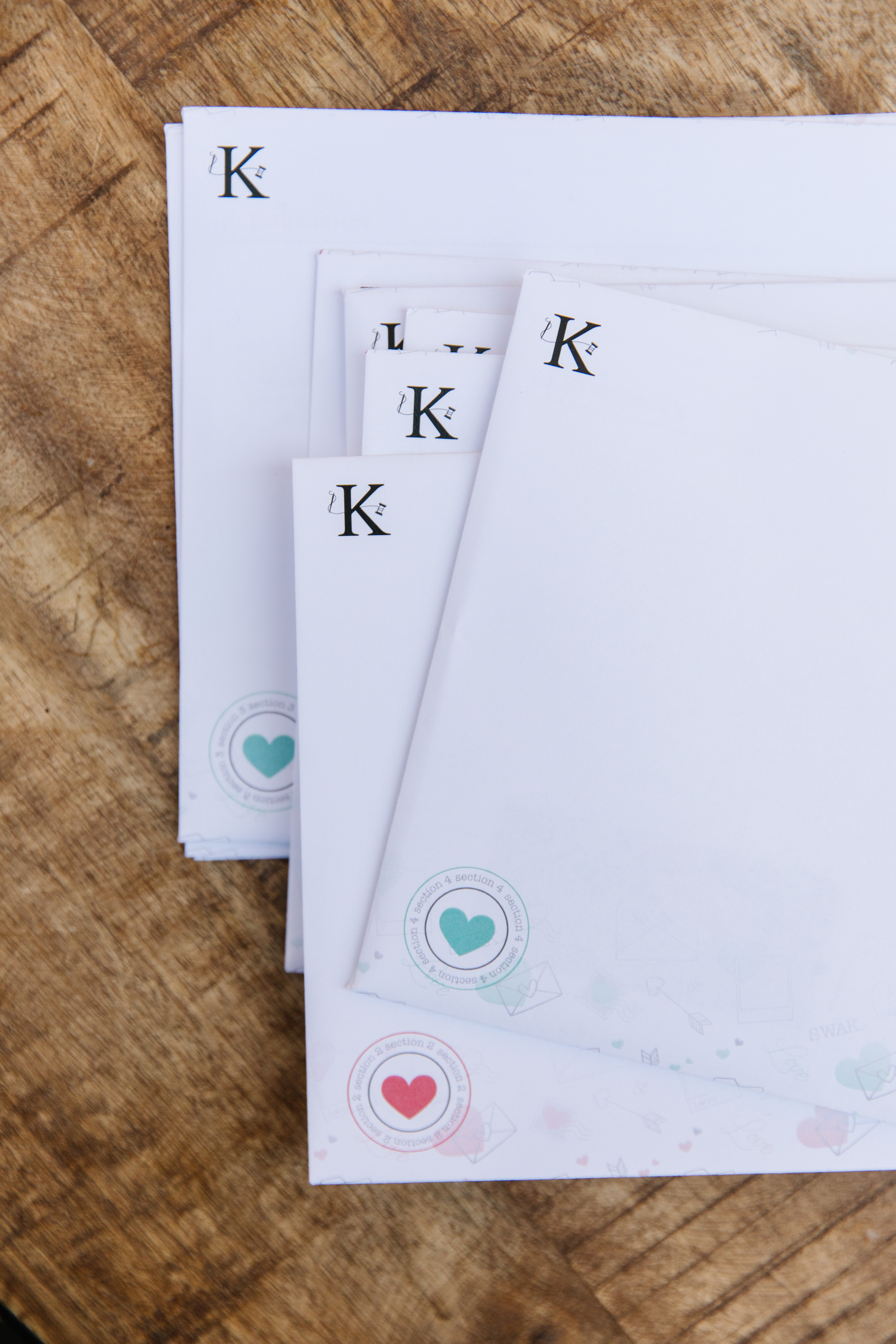

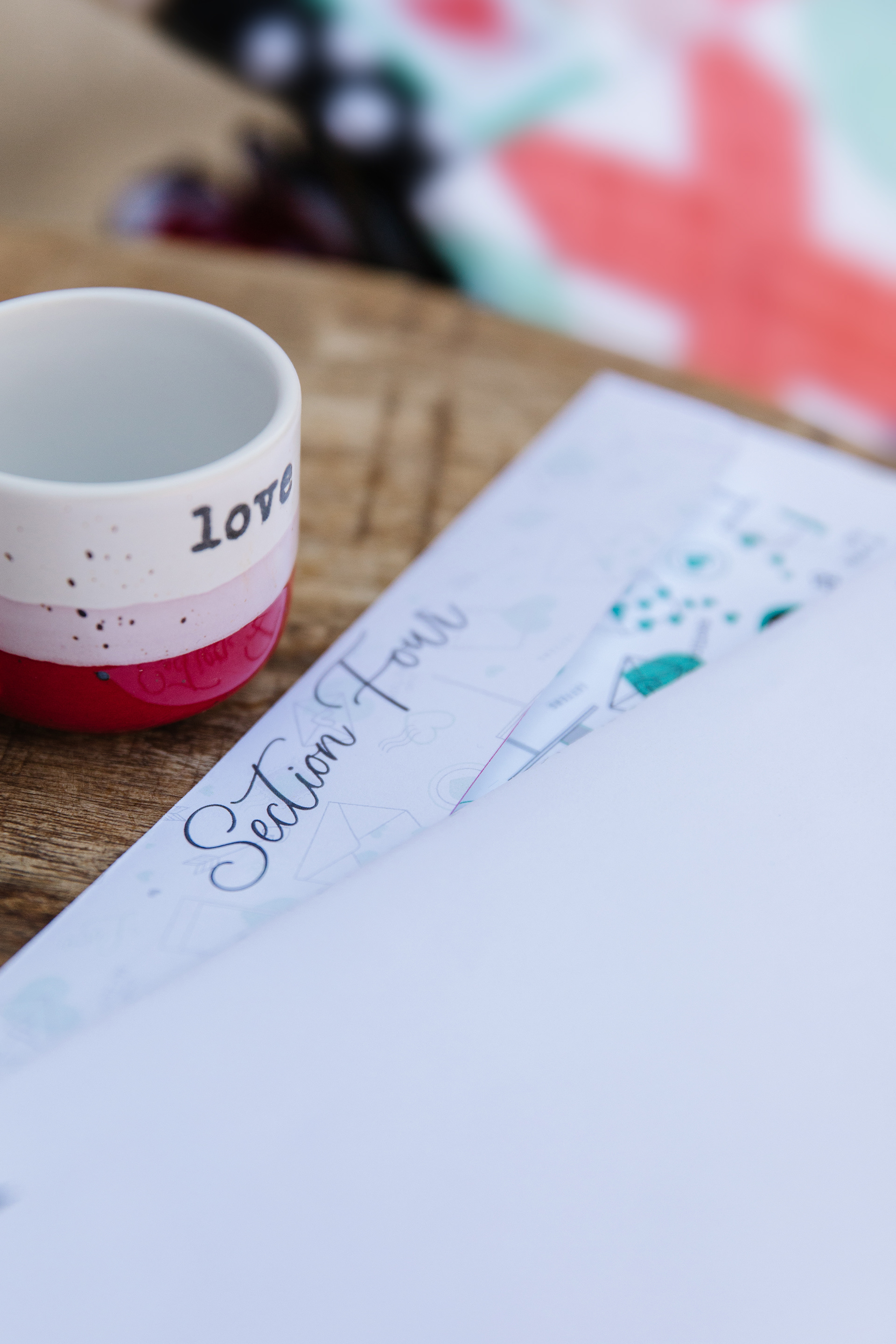

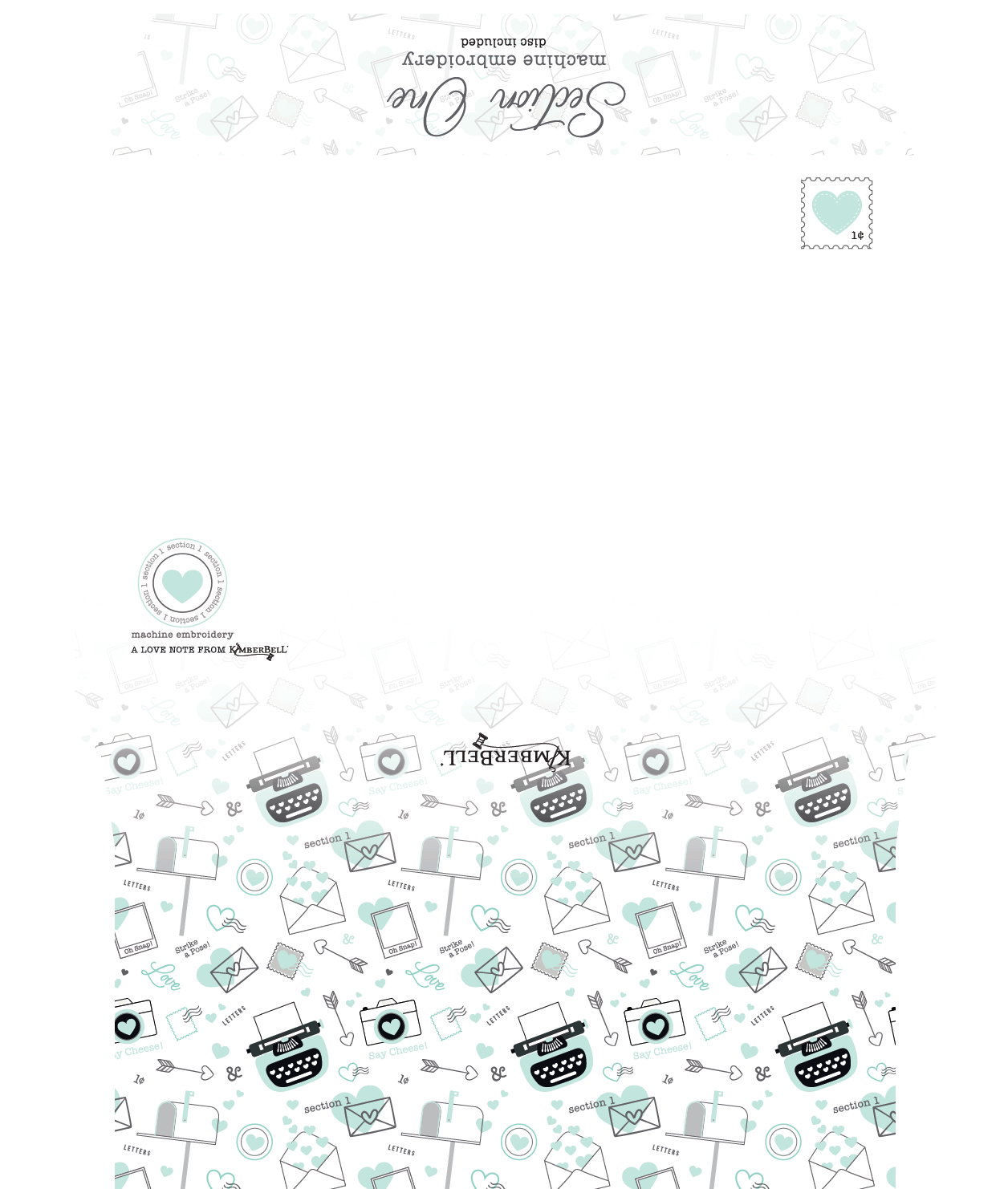
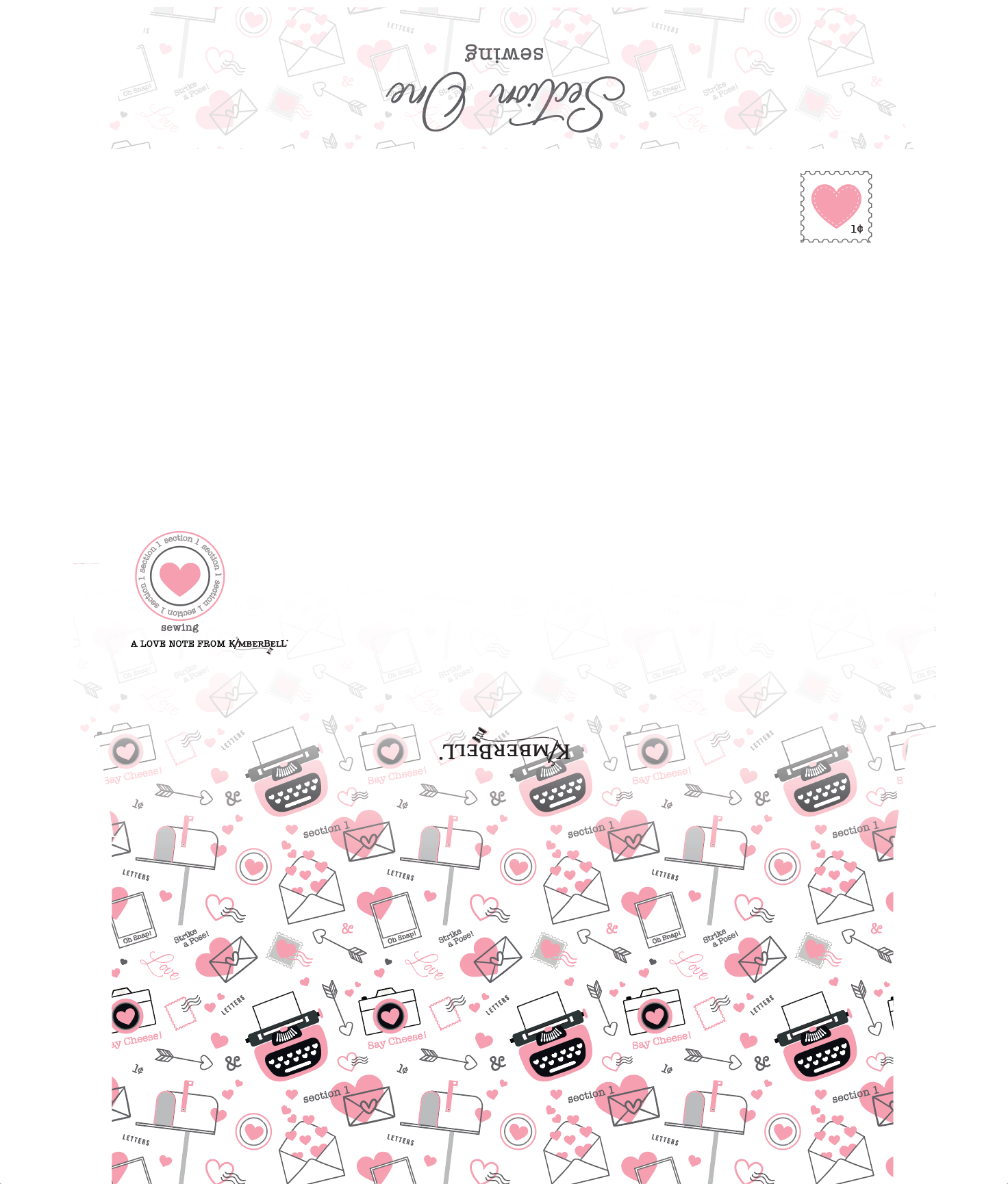
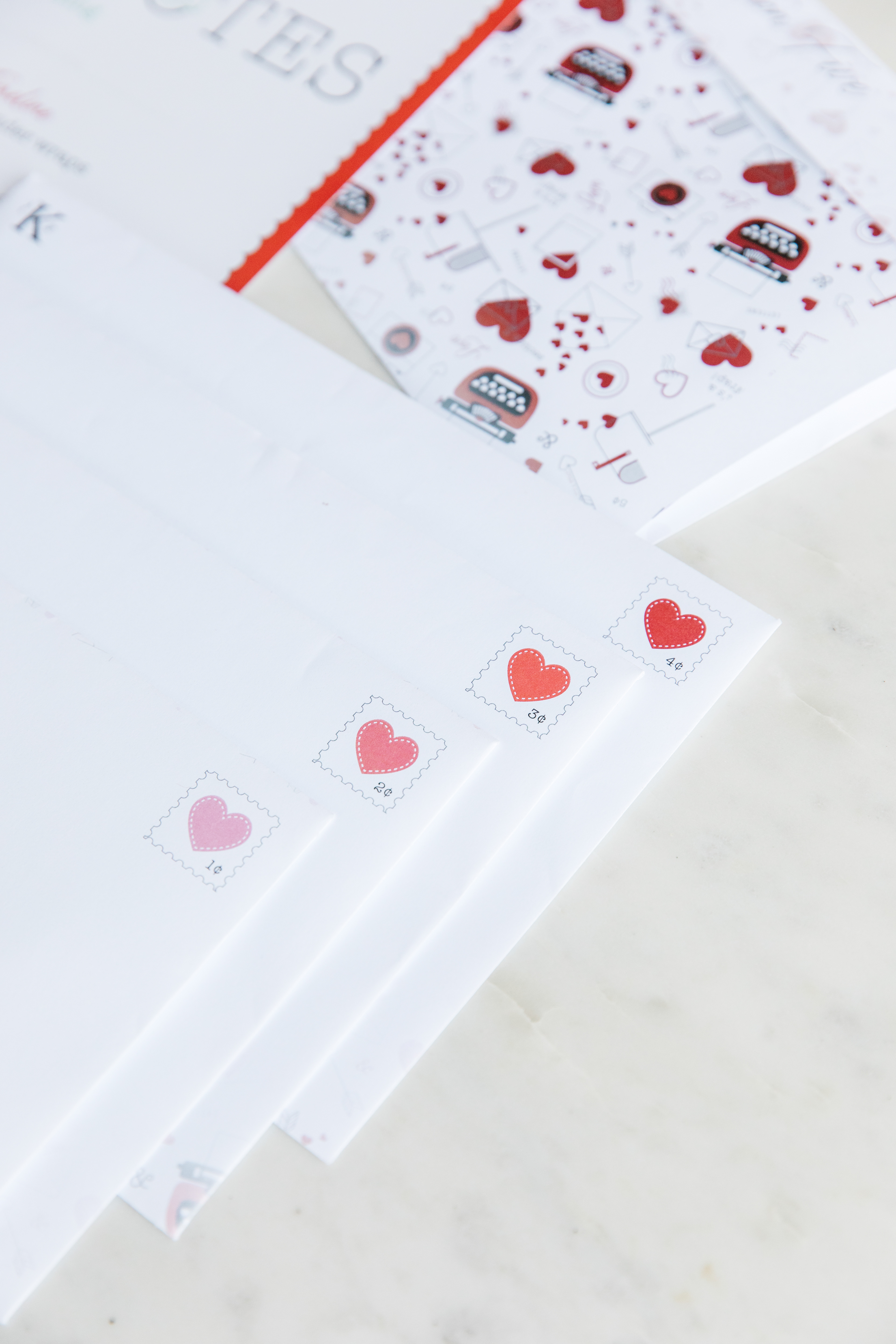
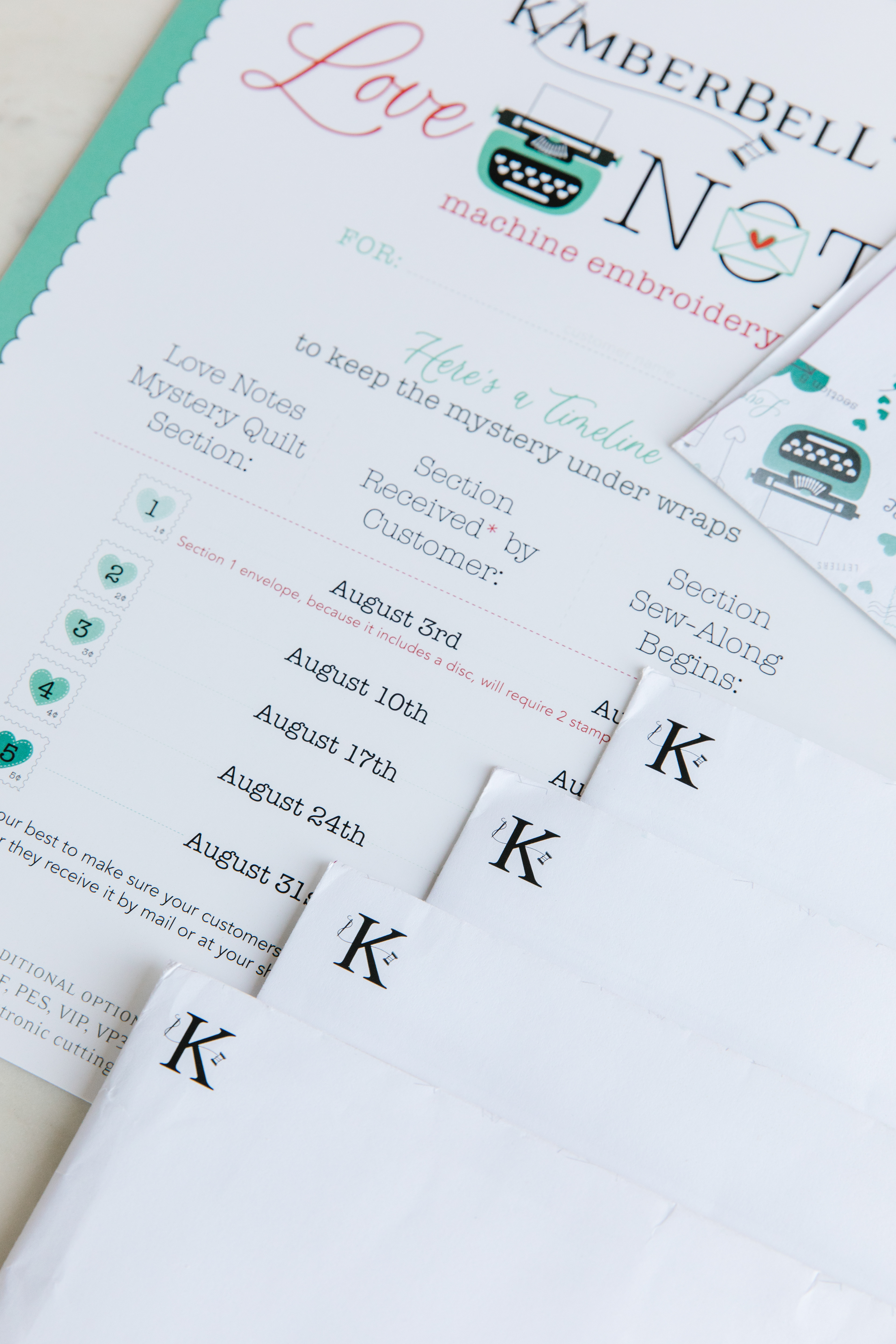
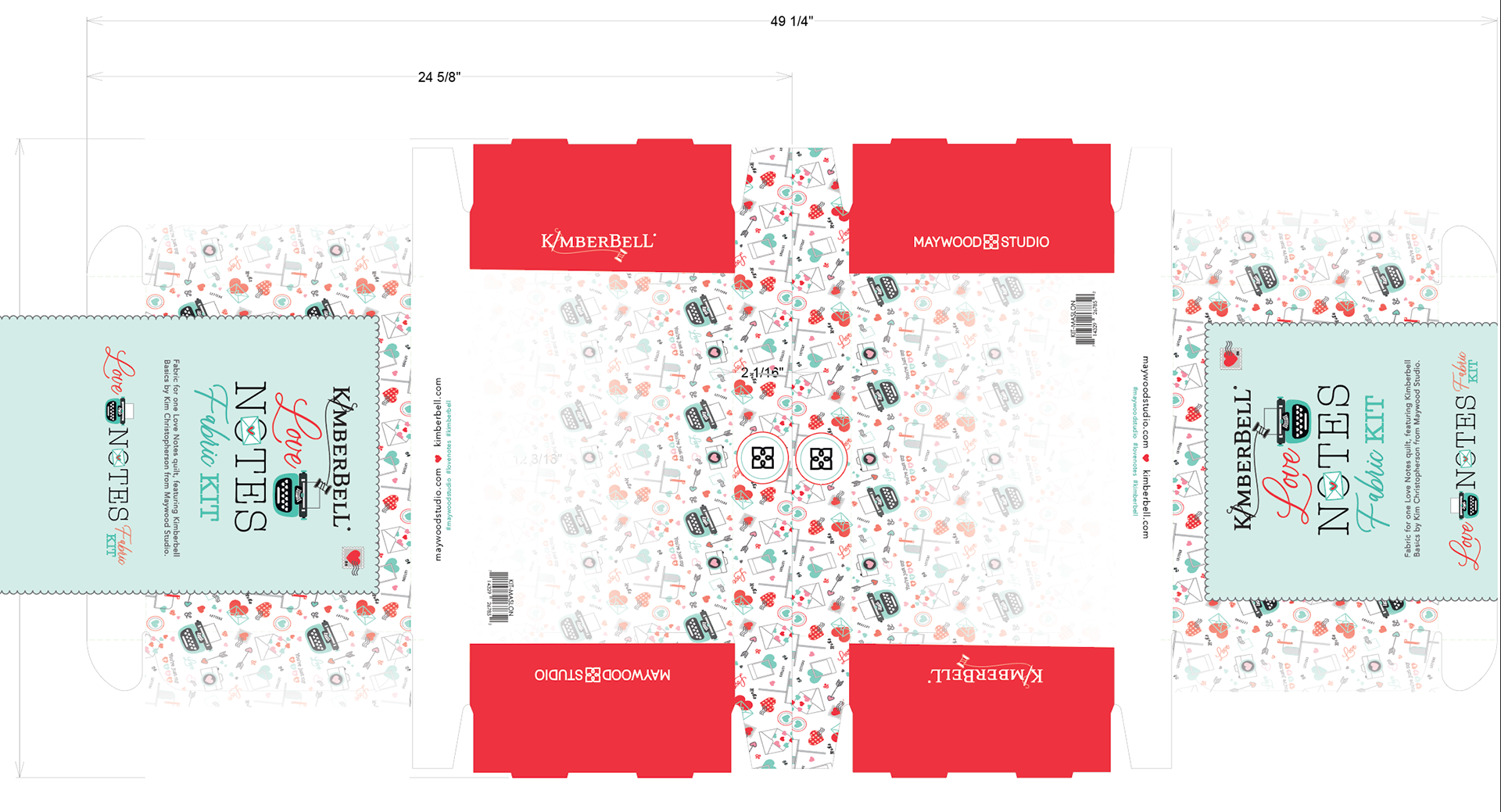
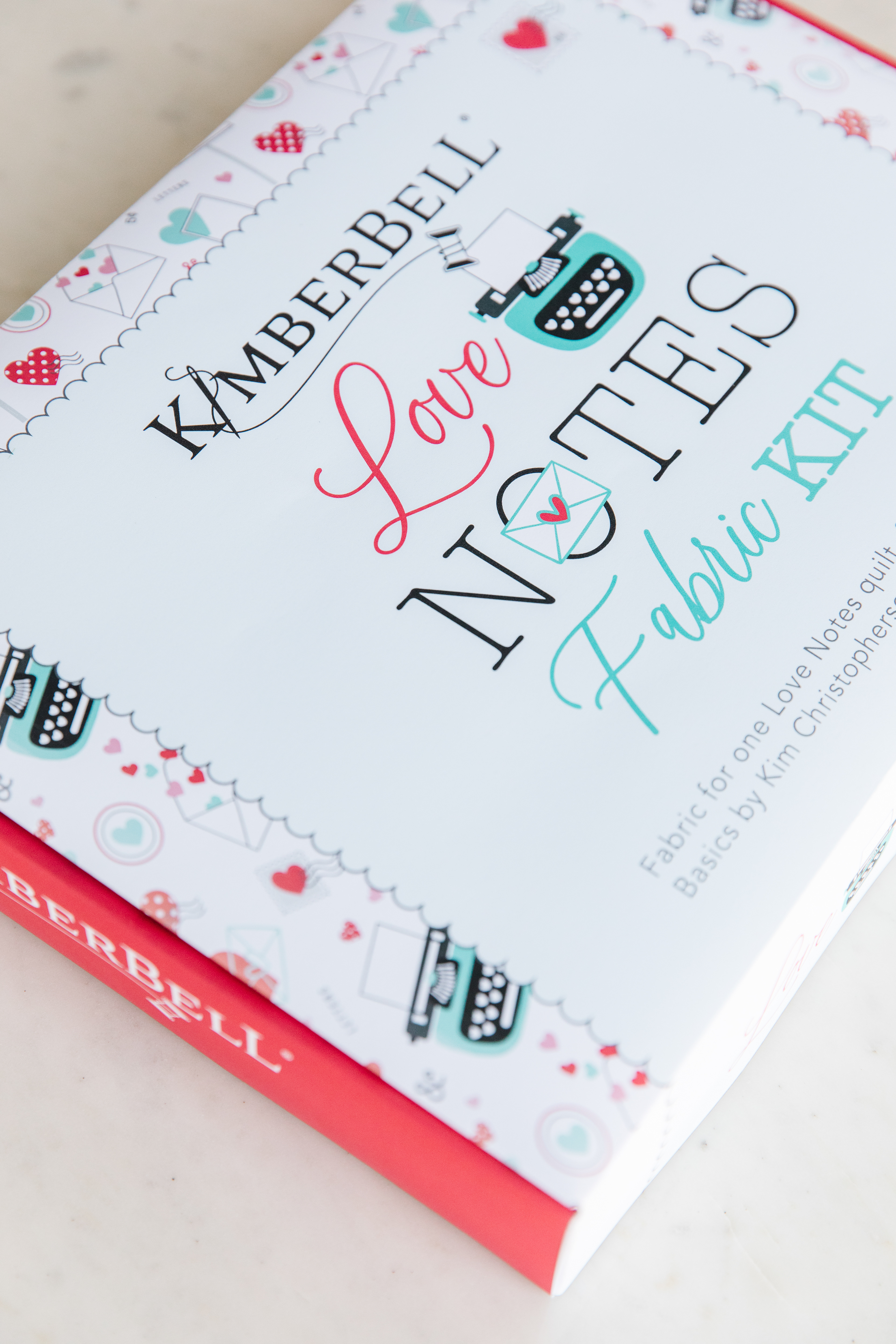
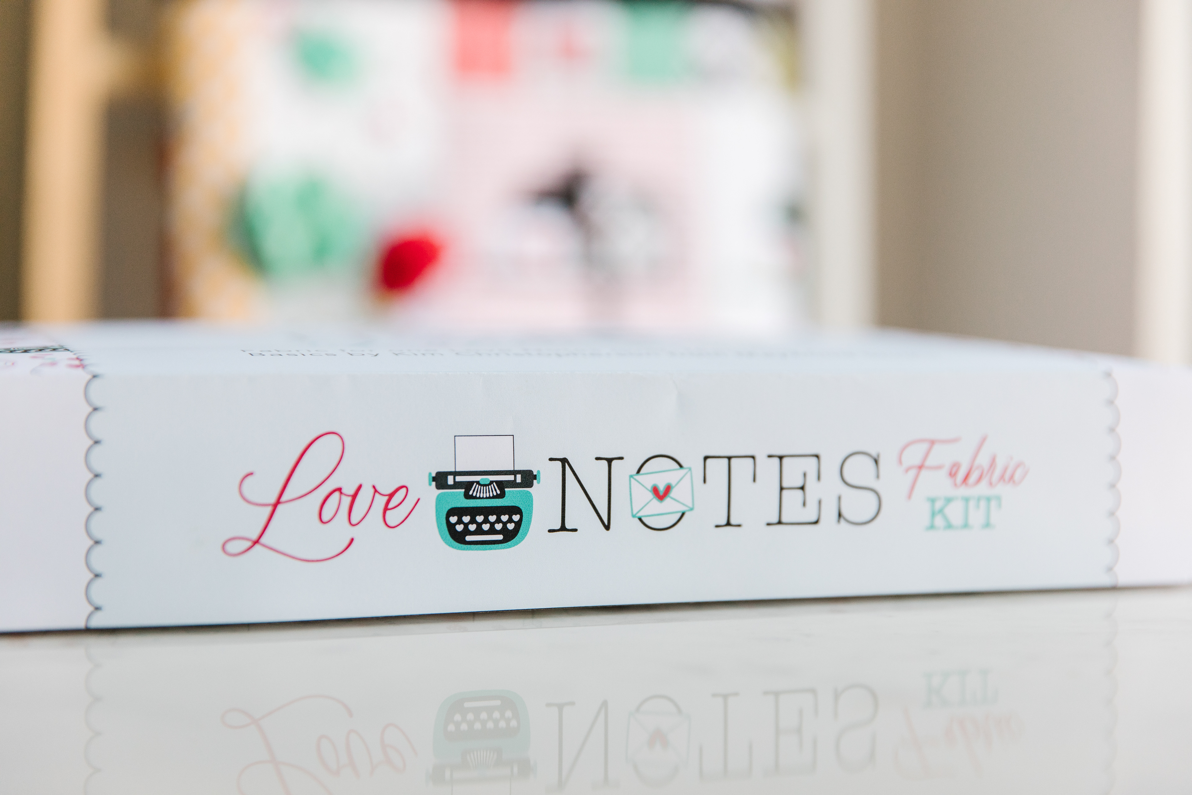
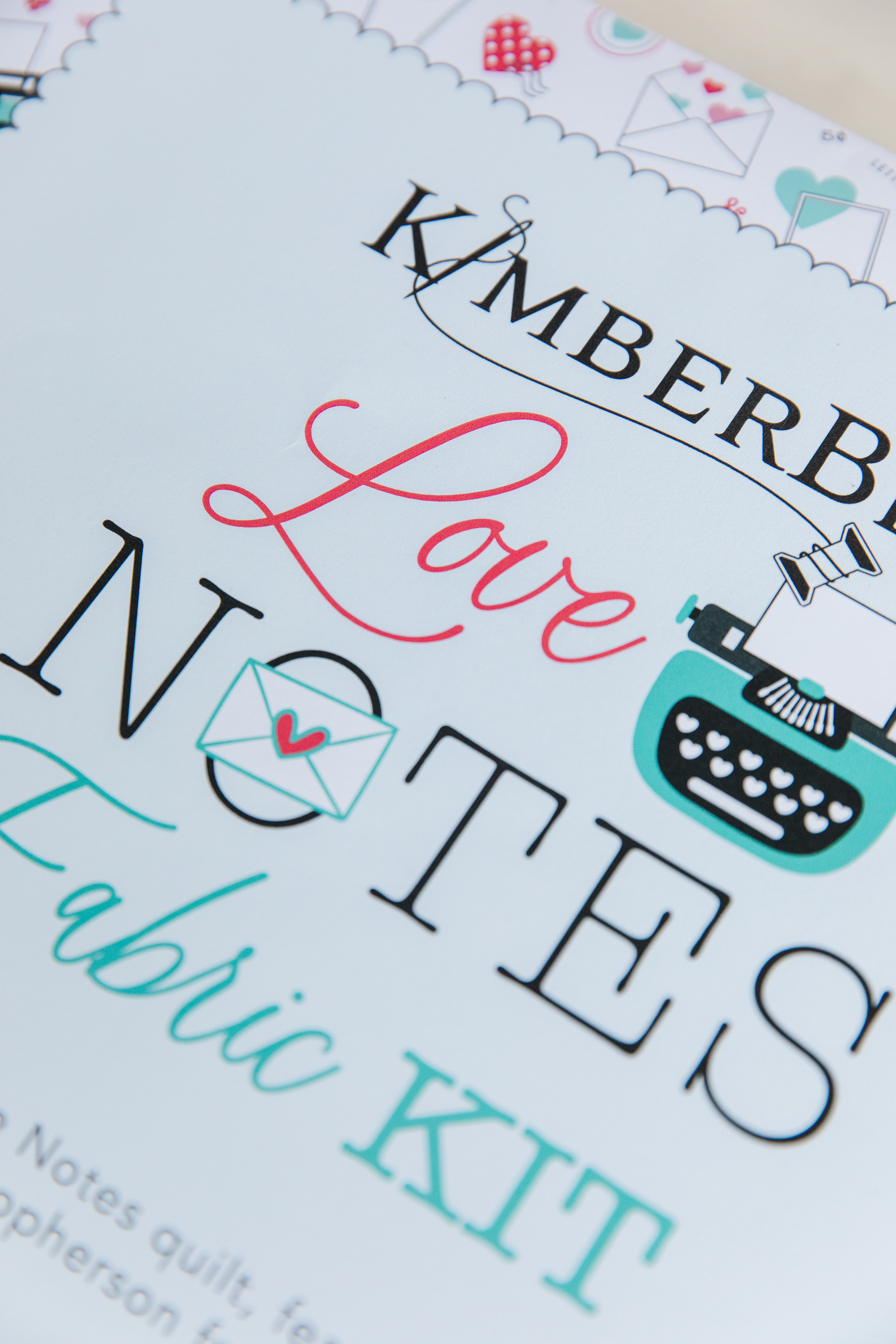
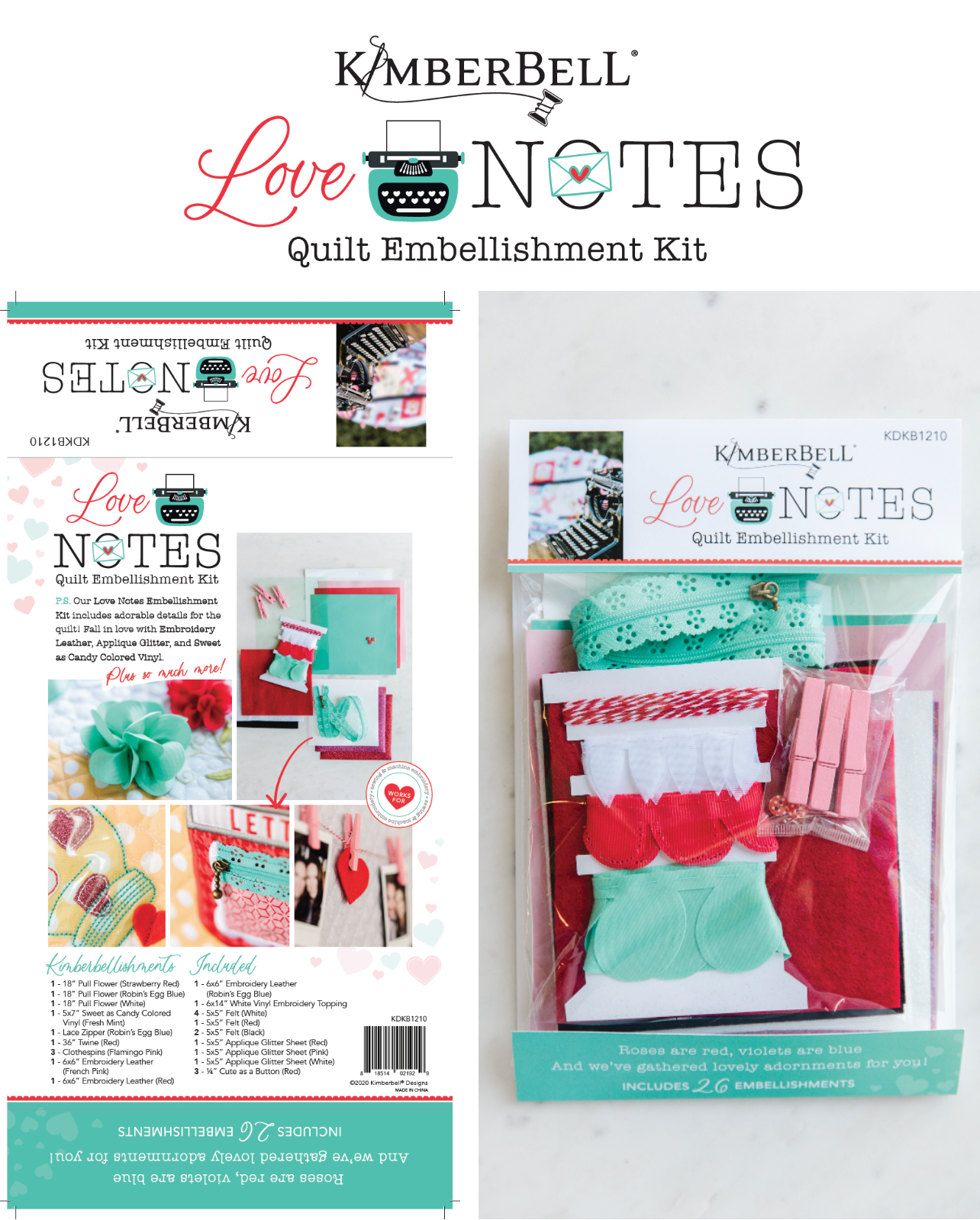
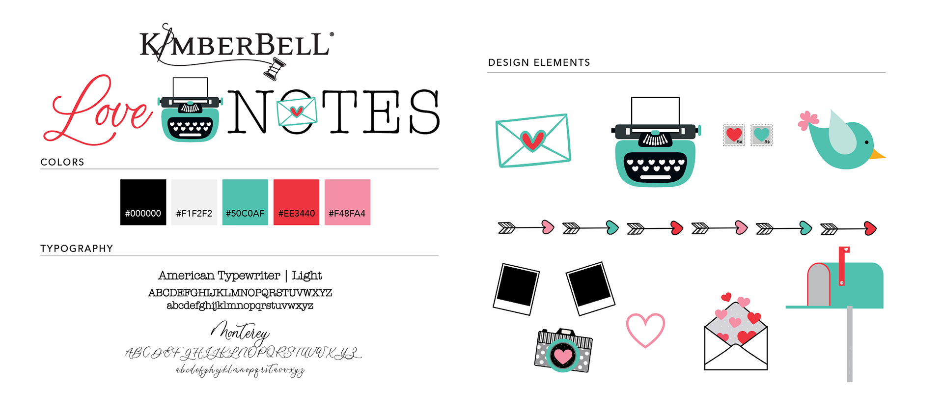
Designed in two formats, sewing and machine embroidery. The color red representing the sewing version and the aqua represents the machine embroidery version. Each week a customer will receive an envelope with a set of instructions inside. The envelope and instructions themselves are designed in an ombre effect to represent the step-by-step process as well. Marketing materials, packaging, and print collateral are designed with both red and aqua to represent both products as a whole.